5 of the Most Innovative Logos ever
- By FITFORGOOD GYM
- •
- 18 Oct, 2016
- •

Logos are a visual representation of a brand, so it's important to have a well-designed and meaningful logo that accurately depicts the business. A logo should aid in making your business memorable. The goal is for the logo to become instantly recognized and associated with relevant emotions to the brand. For inspiration, check out five of the world's most innovative logos:
1. McDonald's
The golden arch of McDonald's is recognized around the world. However, not many people know the history behind McDonald's logo. The golden arch was once a structure used to uphold an overhang that kept customers dry when they were ordering outside. Inspired by the golden arches, the logo designer incorporated them in their logo in 1961. It replaced their first logo that consisted of "tubby chef Speedee". In 1987, McDonald's opened a branded clothing line called McKids in a partnership with Sears Roebuck. Many people loved the McDonald's-themed clothing and continue to buy branded clothing today.2. Nike
Nike's logo is another iconic logo, well-known across the globe. When people see Nike's swoosh check mark, they immediately recognize the brand. Would you believe Nike only paid $35 to have the logo designed? And they still use that logo today. This is proof that businesses don't always need the most expensive logo to find an innovative, quality design. Nike did, however, further compensate the logo designer, Carolyn Davis, when their brand was successful. They gave her a diamond ring and company stock as an extra thank you. When Davis was asked to design the logo, Nike explained they wanted something simple that conveyed motion and looked cool on the side of a shoe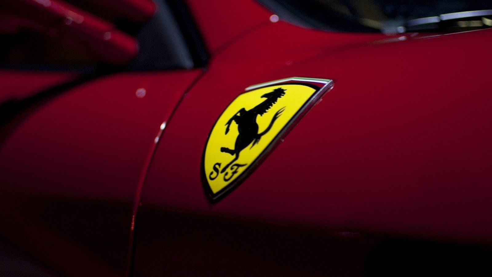
3. Ferrari
Luxury car brand Ferrari also has one of the world's most innovative logos. The horse in Ferrari's logo was originally painted on the side of Count Francesco Baracca's fighter plane. Francesco Baracca was a heroic airman during WWI. Enzo Ferrari met Francesco's parents a few times and was told by Countess Paulina Baracca to put her son's prancing horse on his cars because it would bring good luck. Enzo Ferrari adopted the black prancing horse symbol and paired it with a canary yellow background, the color of his home town Modena, Italy.
4. Coca-Cola
Coca-Cola has become a lifestyle for passionate fans of the brand. You'll find a wide variety of Coca-Cola branded merchandise, including clothing, bar stools, and wall hangings. Interestingly, the design for Coca-Cola's logo was created by Frank M. Robinson, the co-founder and bookkeeper of Coca-Cola. He thought the two C's in Spencerian script would look good on advertising signs, and he was right. The Coca-Cola font is sleek, beautiful, and easy to read.5. Apple
featuring an apple with a bite out of it was designed in 1977. Steve Jobs had requested a logo that wasn't too cute while conveying the company's name. The apple design was given a bite to prevent it from being mistaken as a cherry and to give the logo scale. Apple has a lot of diehard fans that wait in line for store openings and product launches and buy Apple branded merchandise like t-shirts.
A good logo is simple, scalable, and memorable, just as the logos of the five companies listed above. These innovative logos are easily recognizable and have meaning behind them that represents the brand. Pay attention to why each logo is successful and use those qualities to inspire your next logo design.


The challenge was that there were no lights, nor was their a restaurant yet. The renovation had yet to be completed but the marketing had to begin!!